Default Widget
The default widget is considered the most minimal widget you can use. All its features are inherited to every other widget.
You can use the default widget best to display simple static texts and link them to other sites.
Every widget is pre-configured to respect Microsoft’s design language.
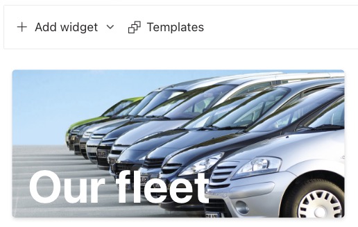
Text layers
Text layers are rich texts which can be placed freely on your widget. The item order (top to bottom) represents the z-axis (front to back) of the text layer.
Add/Edit a Text layer
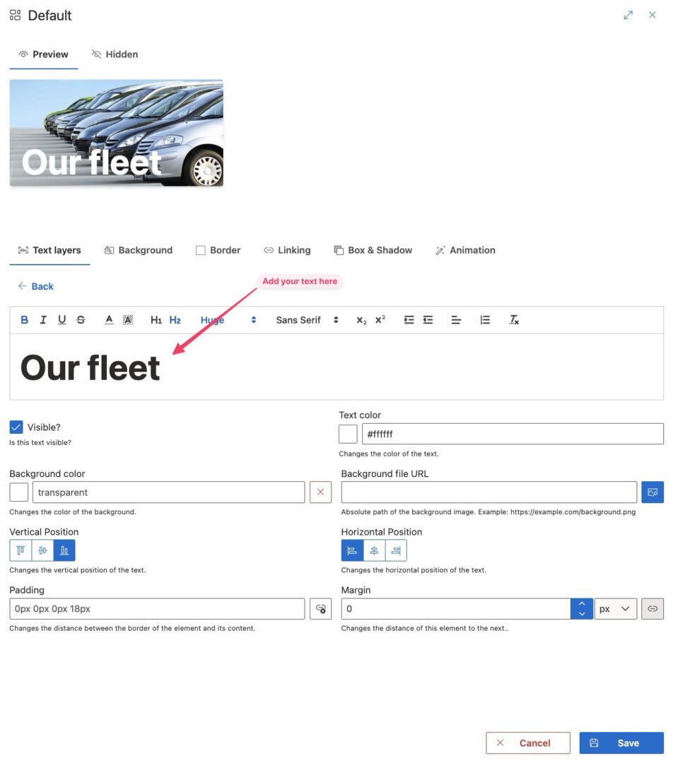
You enter the edit form by adding or editing a text layer.
In this form you can change what your text says, how it looks and where it is positioned. You can also give your text a background if you want to.
Delete a Text layer
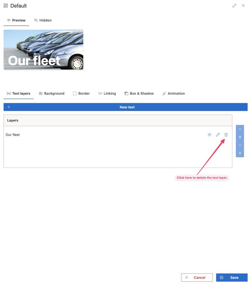
Deleting a text layer is simple. Just click the little delete icon. Be aware that the text layer is deleted immediately.
Background
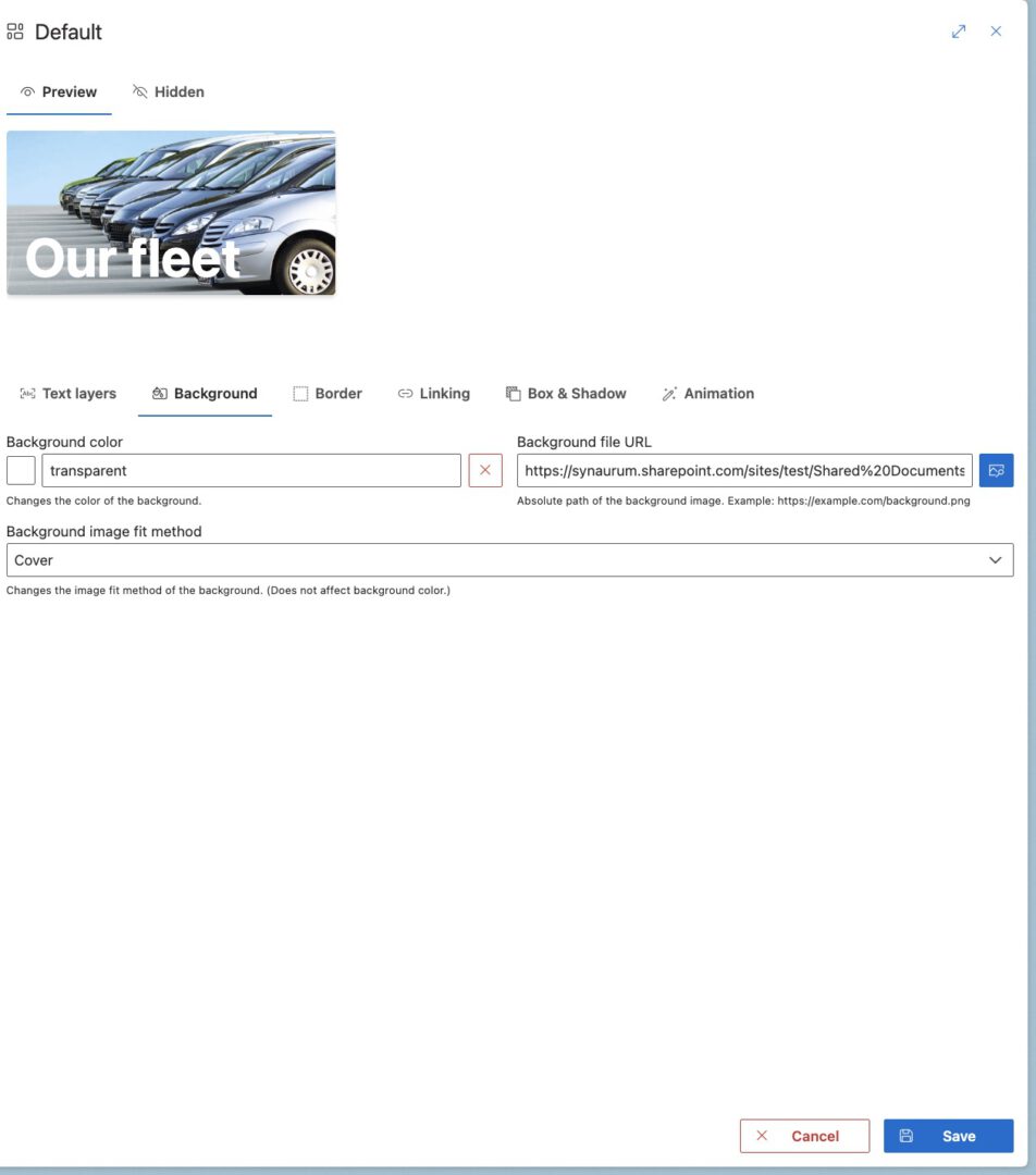
Give your widget a background using the background tab.
Background color
By clicking the square to the left of the input field, you can open a color picker. Your background color isn’t shown if there is a background image defined.
Background image
Add a background image by entering the absolute url of an image. You can use the SharePoint filepicker to browse for your files quickly.
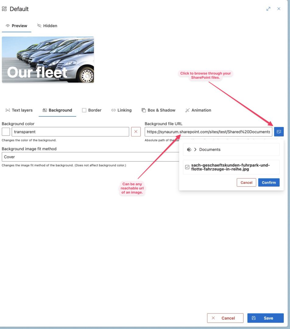
Background image fit method
This option defines how your background image is positioned within the widget.
-
Cover: The recommended option in most cases. The image is cutted and stretched in a way so the background covers all of the widget’s size.
-
Contain: The size of the background image is decreased so all of the background image is shown.
-
Auto: Let your browser decide. Deprecated: This option will be removed in future releases.
Border
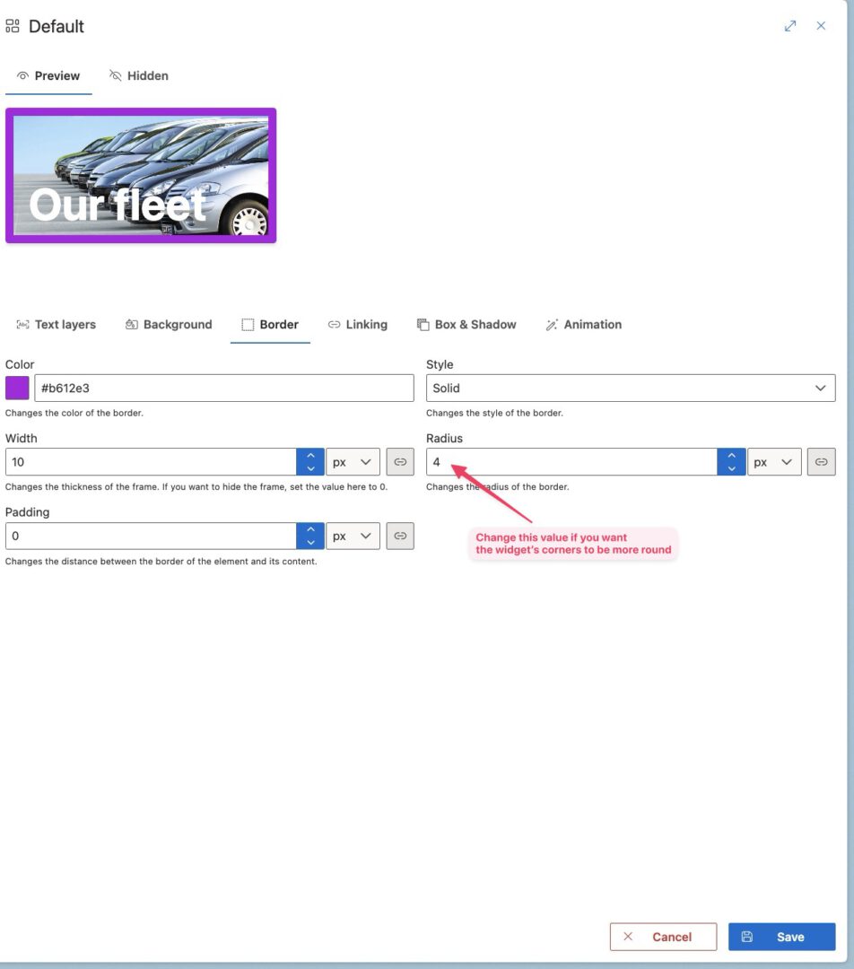
A border can be used to highlight certain widgets. Applying a border reduces the area of the widget which is used by its content.
By default the width of the border is zero so no border is shown.
Linking
Makes your widget a clickable link. Your destination can be opened in the same, in a new window or in a popup dialog.
Make sure your destination url allows embedding if you choose the dialog option.
Shadow
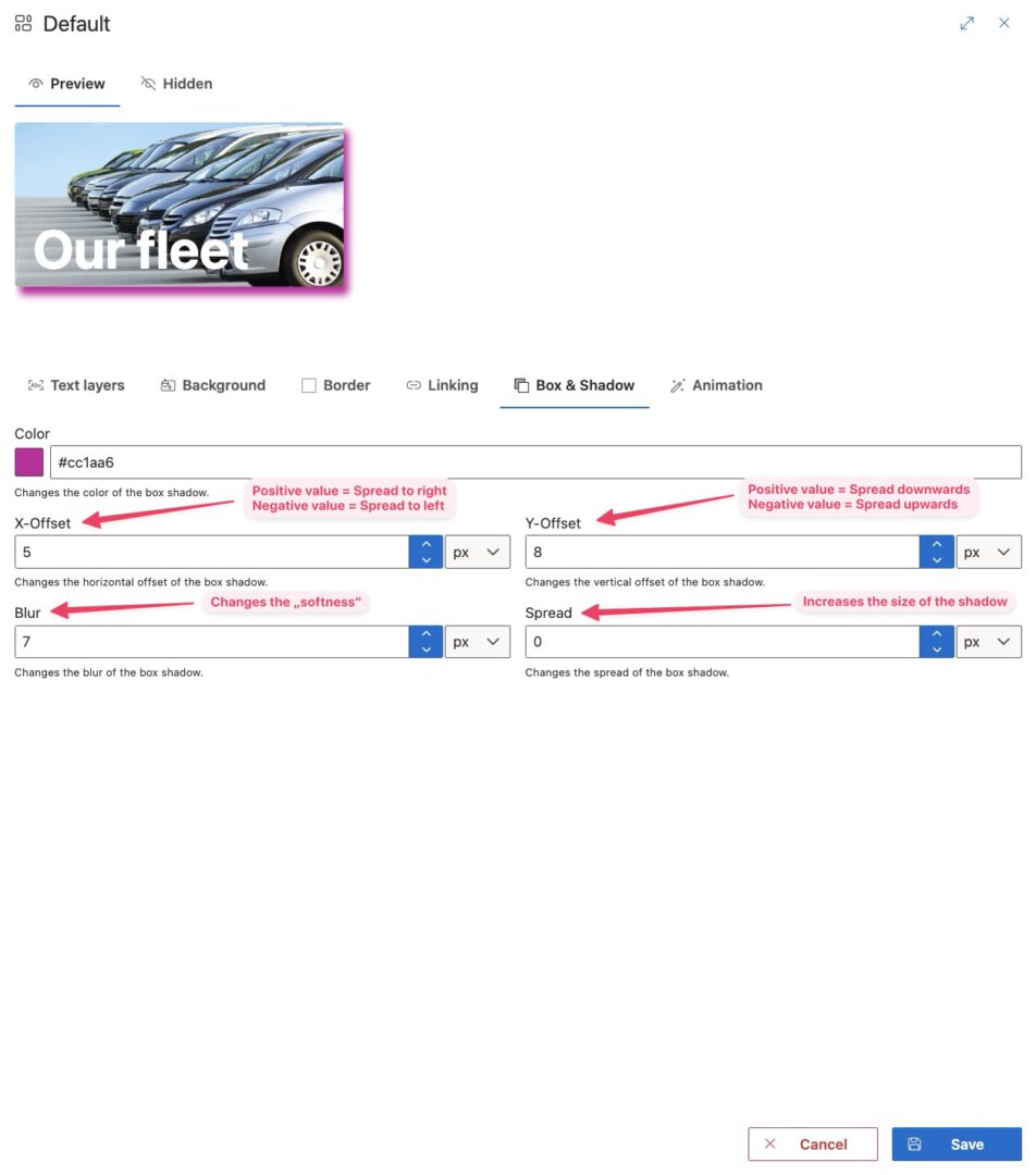
Elevate your widget visually by using a box shadow.
Animation
Animations can be used to catch the user’s attention. Use this if you really want to be sure that everyone recognizes your message.
